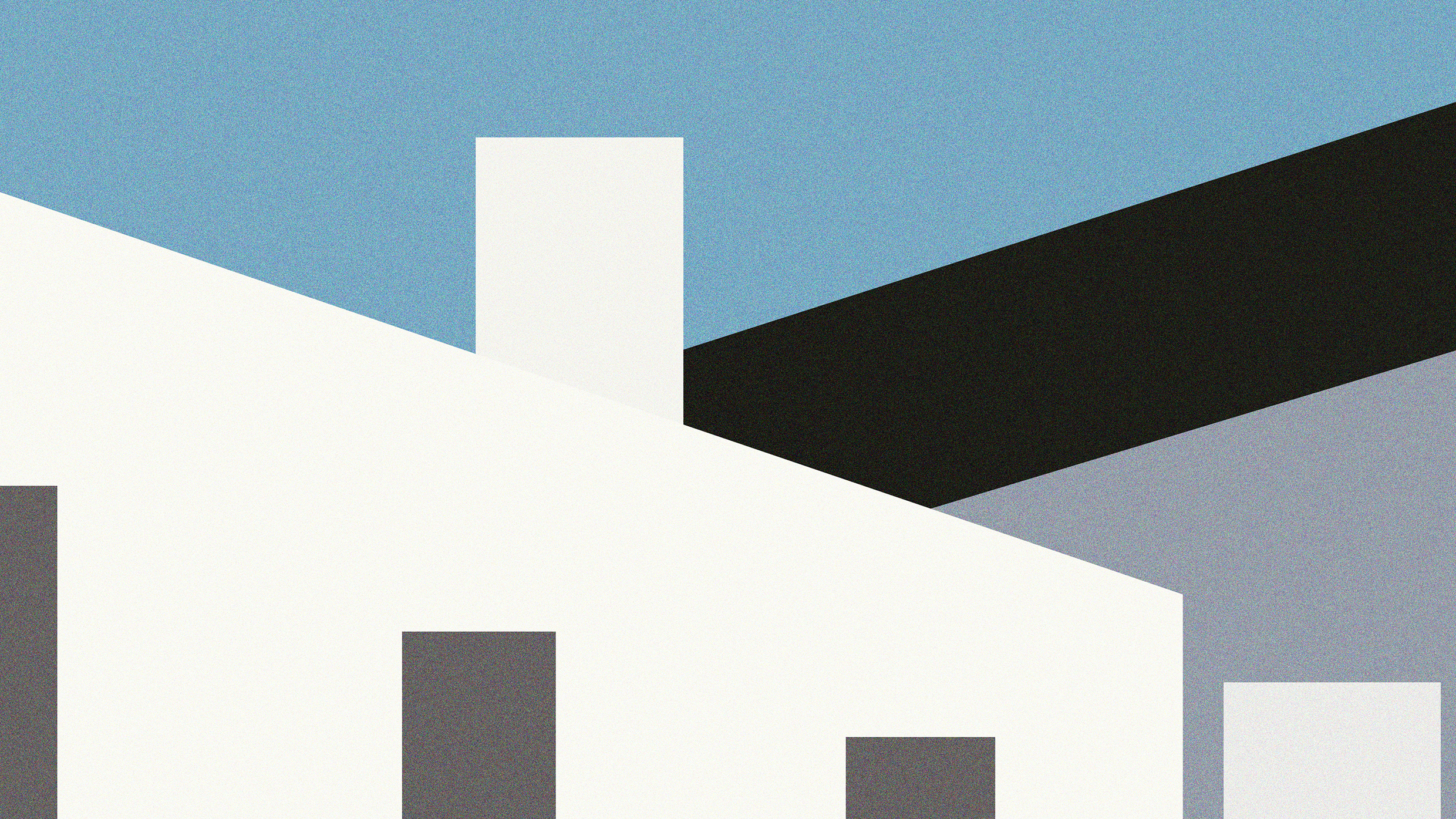
Visual Collection I
c. 2022 – 2023Here I present some examples of visual outcomes that I produced during my time at Adjaye Associates. Due to the confidentiality of the work, I have only picked out and shared a very limited collection. These have been selected on the basis that they do not indicate or allude to any context, hence they can appear very abstract – I felt this instead led to a newer tangent of interpretation and appreciation as individual art pieces. Most of these are manipulations from my original creation or by-products during the creative process.

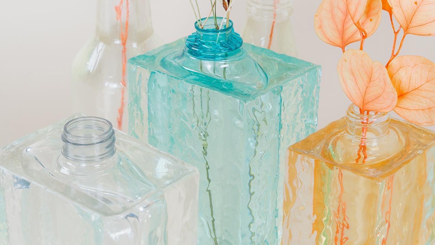
16 Objects, 24 Vases, 44 Days
c. 2022When I took some time to observe the bottles on my bathroom ledge, there was a moment when the shapes and silhouettes were surprisingly unique and beautiful, especially if we were to remove the distracting graphic branding placed on the surface. It became an interesting thought that we use these underlying and very normal items repetitively without much appreciation, at least from my way of living. I therefore wanted to enhance the sole beauty hidden within each of them through experimental creative processes to exemplify their existence and produce unusual vases that people could appreciate – something both functional and beautiful. I selected a total of 16 objects found inside household settings and produced a total of 24 vases within a time frame of 44 days.
All the Chairs Inside my House
c. 2022Chairs are everywhere and they are embedded within our daily routine of living, but most of us do not realise it. We build some of our greatest moments or carry out conversations, connections and interactions with the aid of a chair. They simply hold so many memories and can inevitably construct the identity of any space.

The only book showing the handmade and hidden Food from Wallace & Gromit
c. 2022This project shows how much of an obsessed enthusiast I am with the infamous British show, Wallace & Gromit.


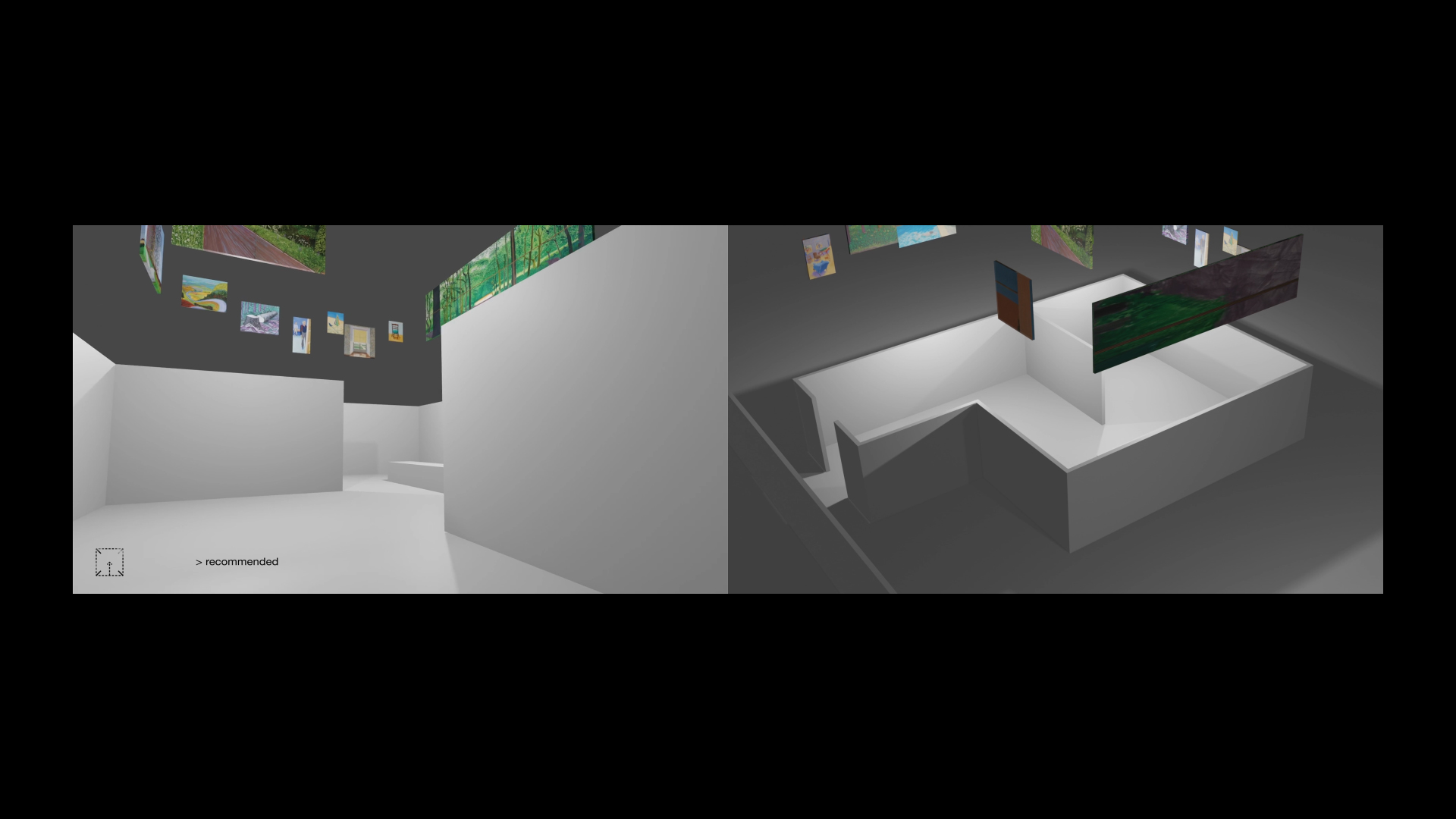
Cur (ai) tor
c. 2021For this project, I decided to develop an intervention in response to a ‘designerly act’ that I felt could be automated. I pursued the direction of automating the role of a curator – I wanted to form a system where the AI could recognise an interior gallery space and automate the position of artworks through an augmented reality visualisation.
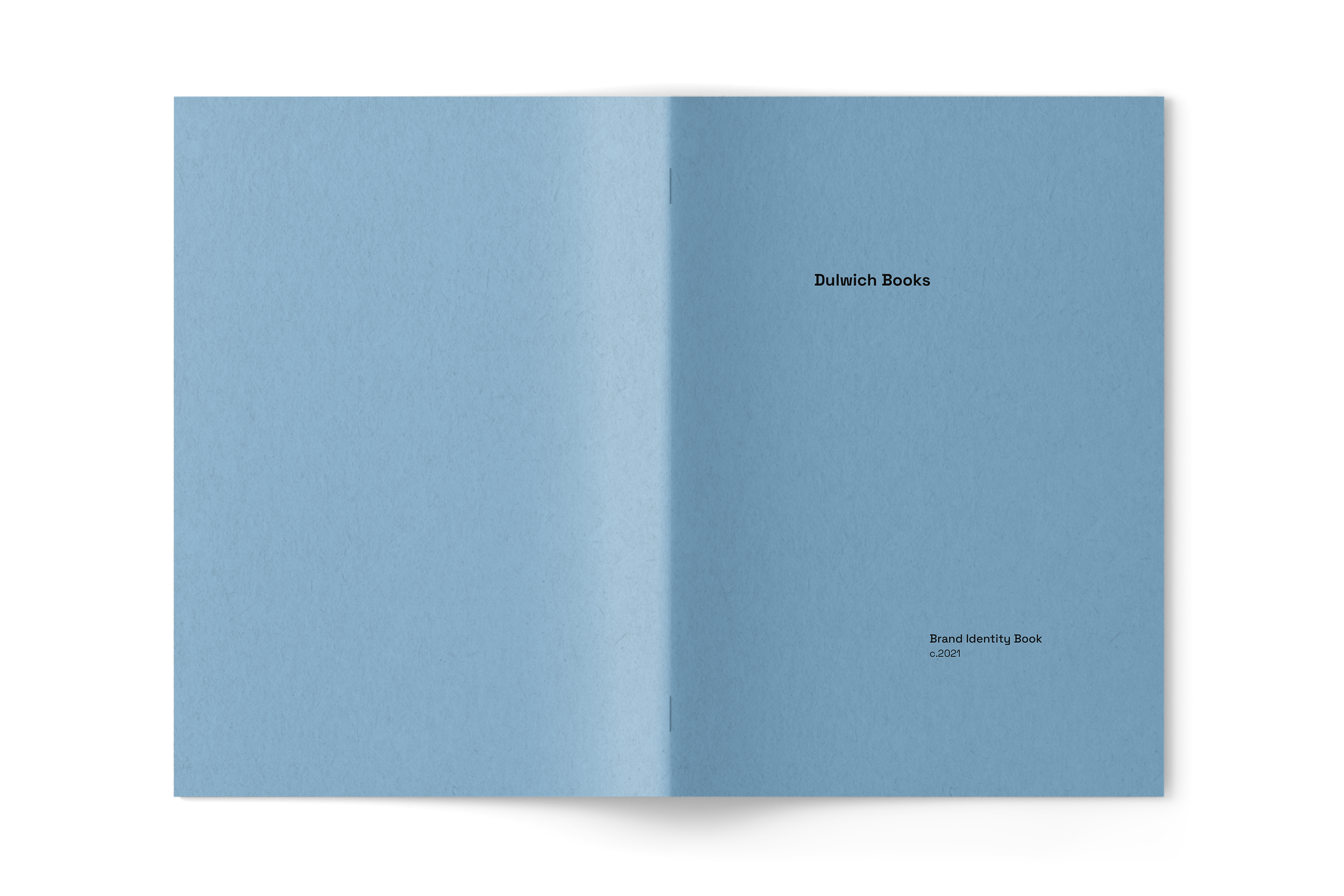
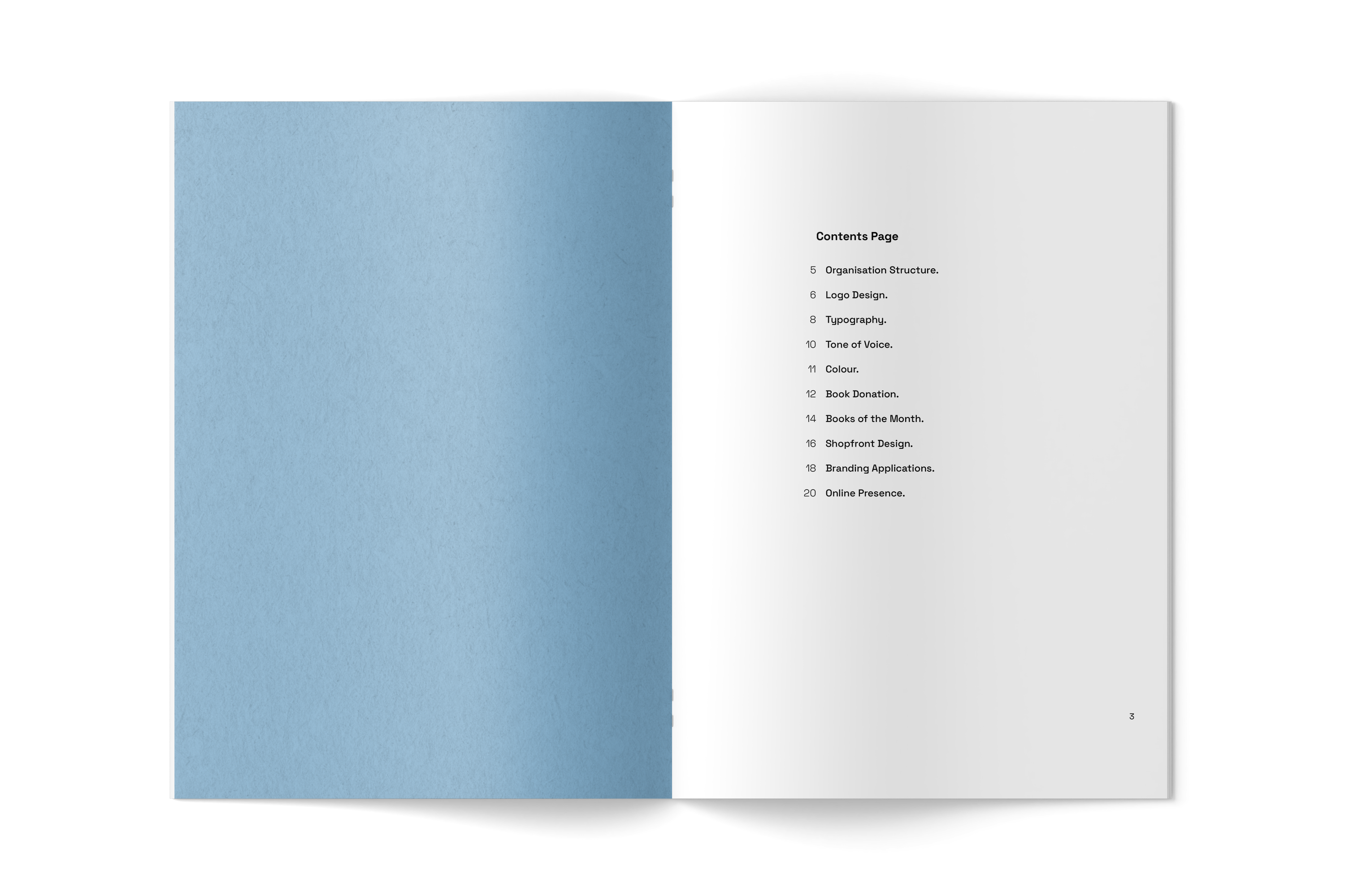
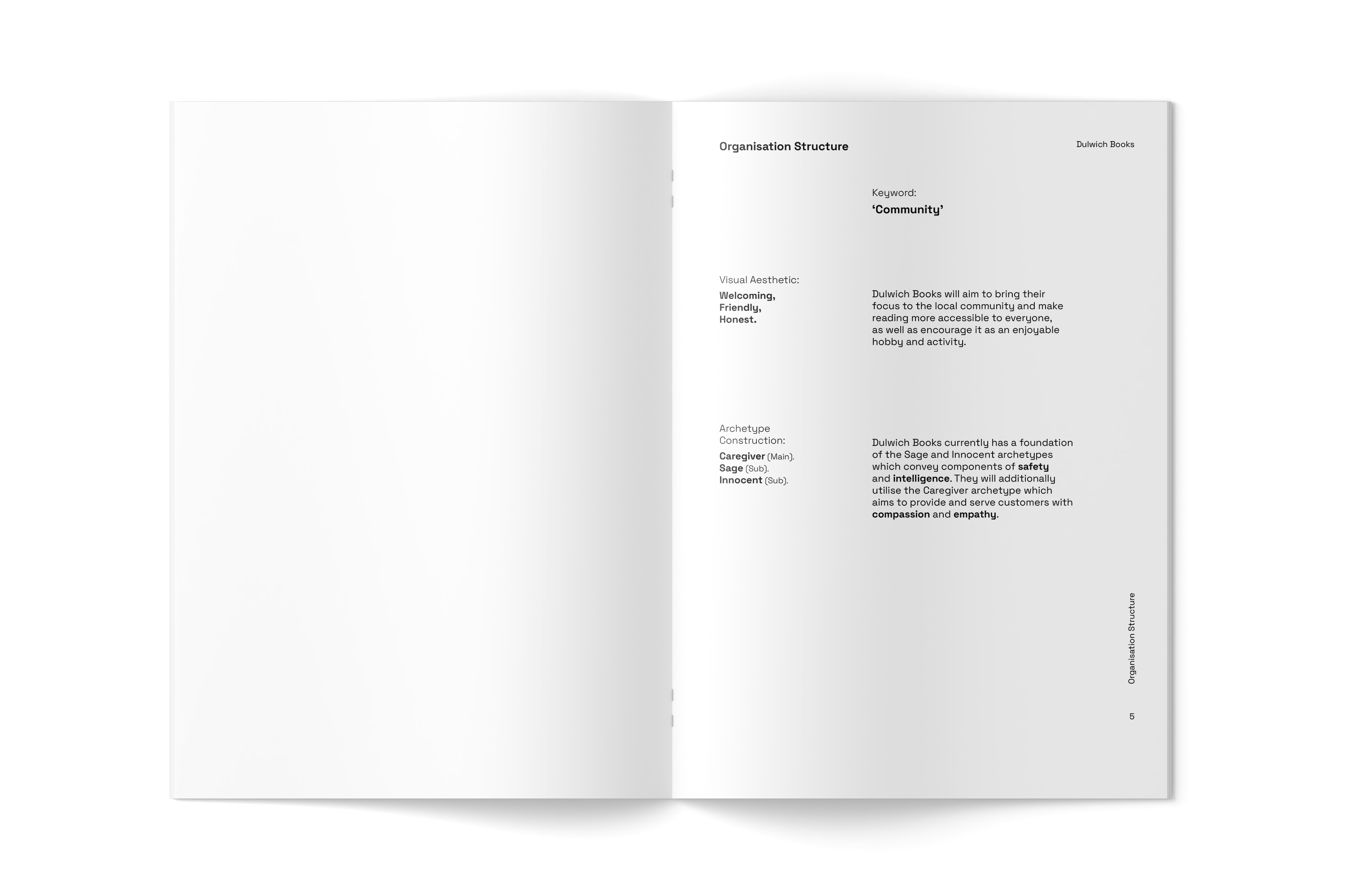
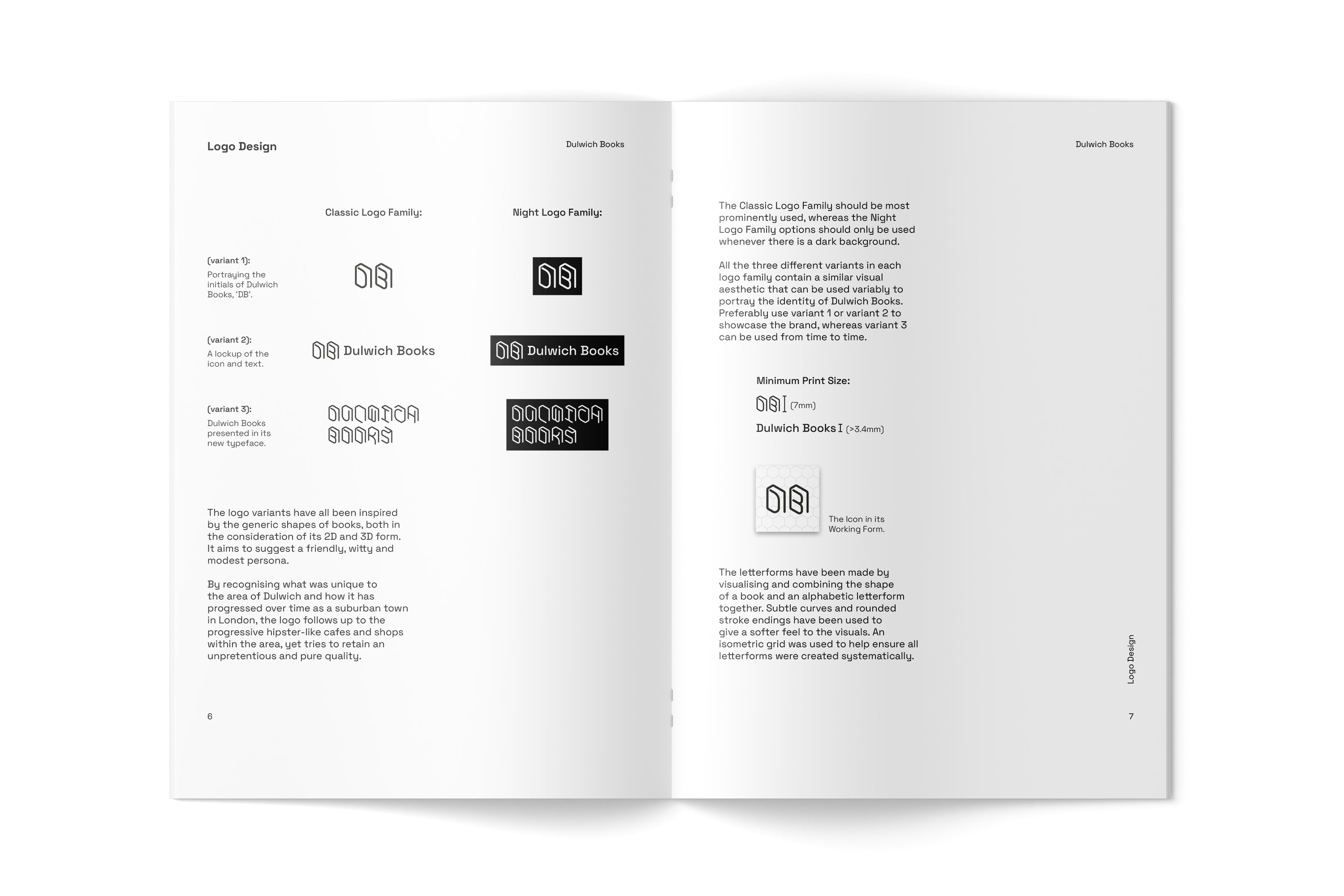
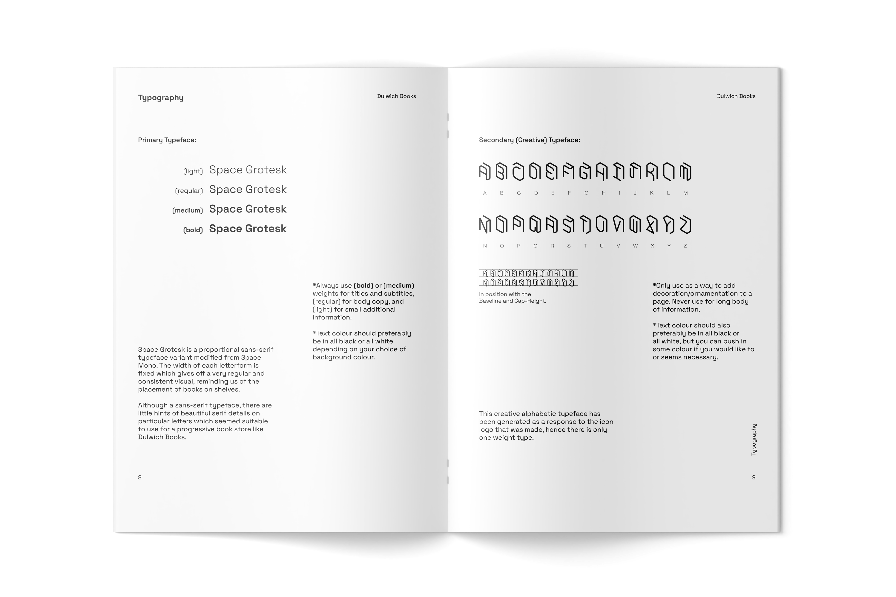
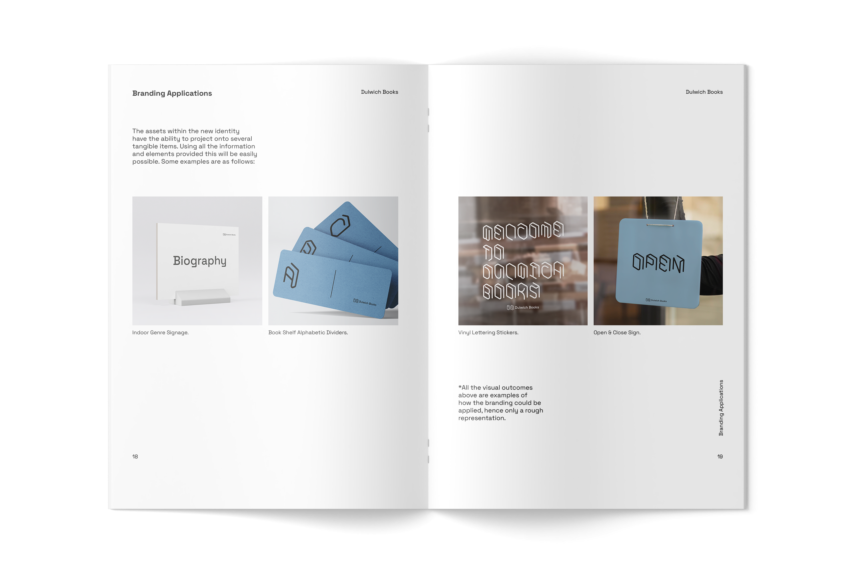
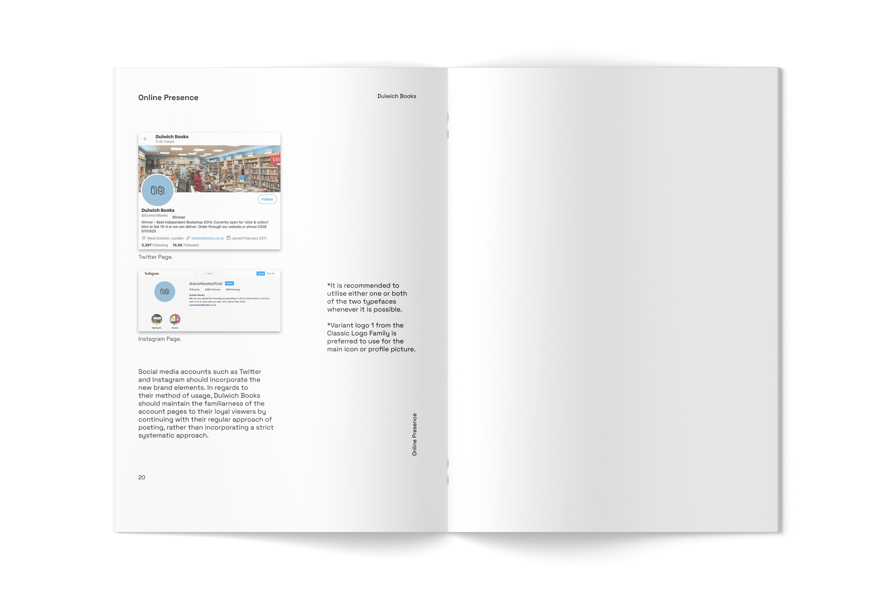
Dulwich Books
c. 2021This project explored the aim of creating a new sustainable and generative visual identity for an ‘uncorporate’ organisation. I selected Dulwich Books for my chosen independent organisation, which is a long-serving book shop that my parents had often taken me as a child whilst growing up in the local area.
Gap on Stage
c. 2020‘Gap on Stage’ was a fictional strategic campaign that I created. I imagined this to be a new platform where upcoming artists are promoted and shared. Successful applicants would be invited in-store on different time schedules to perform live. Gap would professionally produce and capture video content of these live performances which would later be shared on their social media, website page and YouTube channel, which all have a relatively large following.

a continued happiness
c. 2020‘a continued happiness’ is an independent handmade bead jewellery shop founded by myself. It currently runs only online on platforms such as Etsy and Instagram. I am responsible for the production of the products, shipping, the visual identity and all other visual assets. I decided to start this little shop of mine as I felt there was a lack of diverse beaded jewellery that I personally would want to wear.

Our World in Lockdown
c. 2020‘Our World in Lockdown’ was a collaborative project with YiWen Liu (@yiwen.yvn). This was during the most unsettling times of the global COVID-19 pandemic. As we were set into national lockdown for several months, we decided to initiate our own self-directed project by producing illustrations about our combined thoughts, hopes and feelings during this time.
Commission: Cambridge Tech & Society
c. 2020Cambridge Tech & Society, also abbreviated as ‘CT&S’, is a student-run society group that explores the social and political effects of technology at the University of Cambridge. It further endeavours on how technological innovation can best secure and further the ideals of social justice and democracy. I had the role to design the logo and other relevant visual assets for this currently well-established society.

Commission: MNT, Mentors Not Tutors
c. 2020MNT, abbreviated for 'Mentors Not Tutors', is a new start-up company to provide affordable and high level of tutoring for those who have difficulty to provide for their children, ranging from all academic levels. I was given the task to design the logo and other relevant visual material for this very positive, friendly and studious service.

Samsung UK x CSM: an Imaginary Indoor Playground
c. 2020As part of a collaborative project with Samsung and CSM Graphic Communication Design students, I was fortunate enough to be selected and showcase my work for an online exhibition held on the Samsung UK webpage. The aim for this digital exhibition was to demonstrate the role of the home through the eyes of current students, us. Due to the ongoing pandemic of COVID-19 at the time of this project, all applicants had to work remotely with limited resources and had a significant influence in the way we pursued our individual project entries.

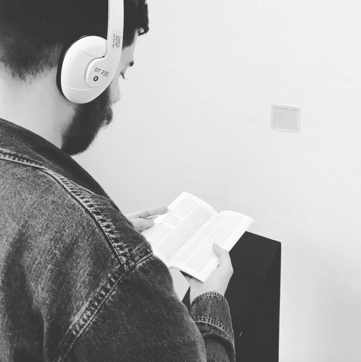
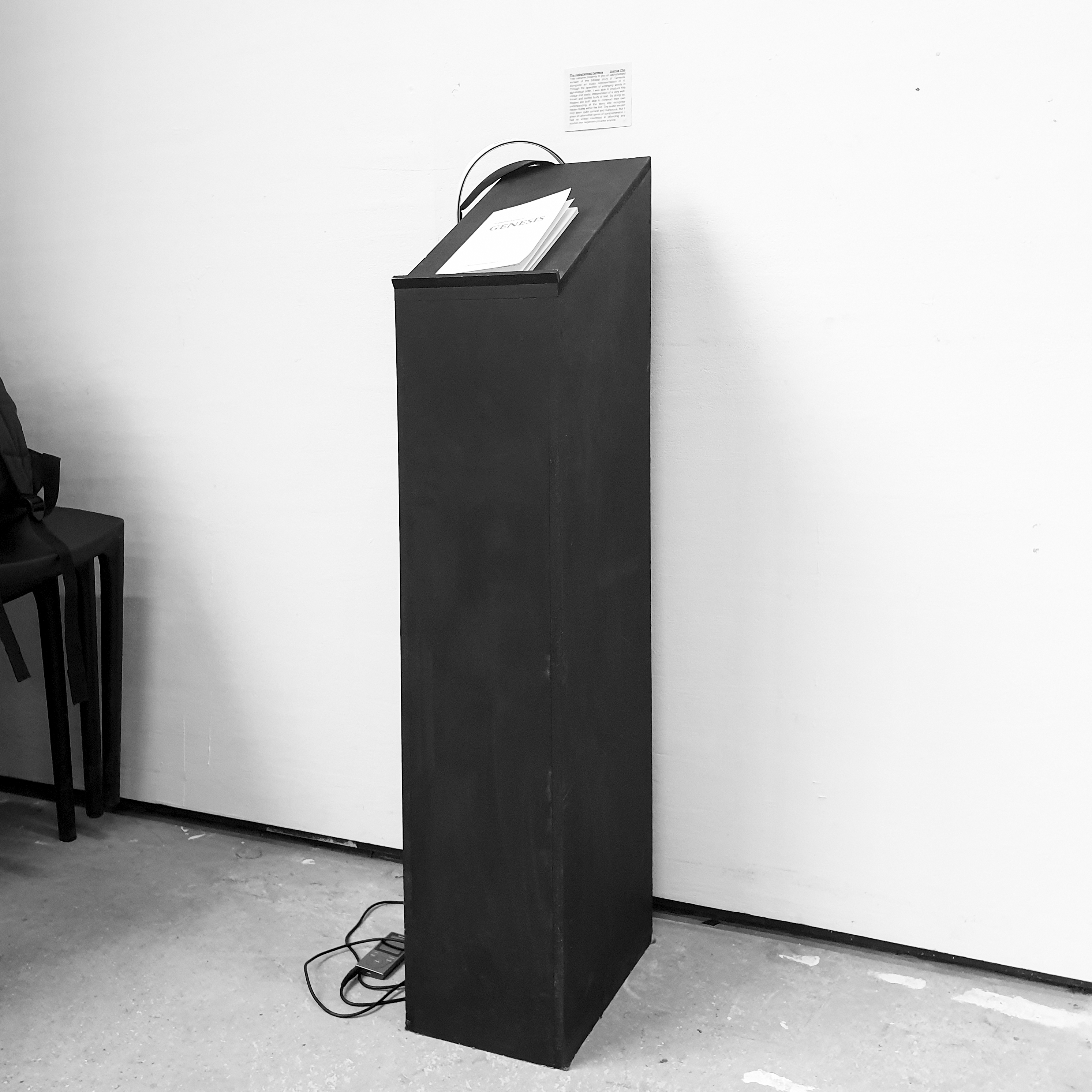
The Alphabetised Genesis
c. 2020This project outcome presents to you an alphabetised version of the biblical story of Genesis, alongside an audio representation of it. Through the operation of arranging words in alphabetical order, I was able to produce this unique and poetic interpretation of a very well-known and sacred body of text. By doing so, readers are both able to construct their own understanding of the story and recognise hidden truths within the text. The audio version may seem quite comical and humorous, but it gives an alternative sense of comprehension. I had no vested interested in offending any readers nor negatively provoke anyone.
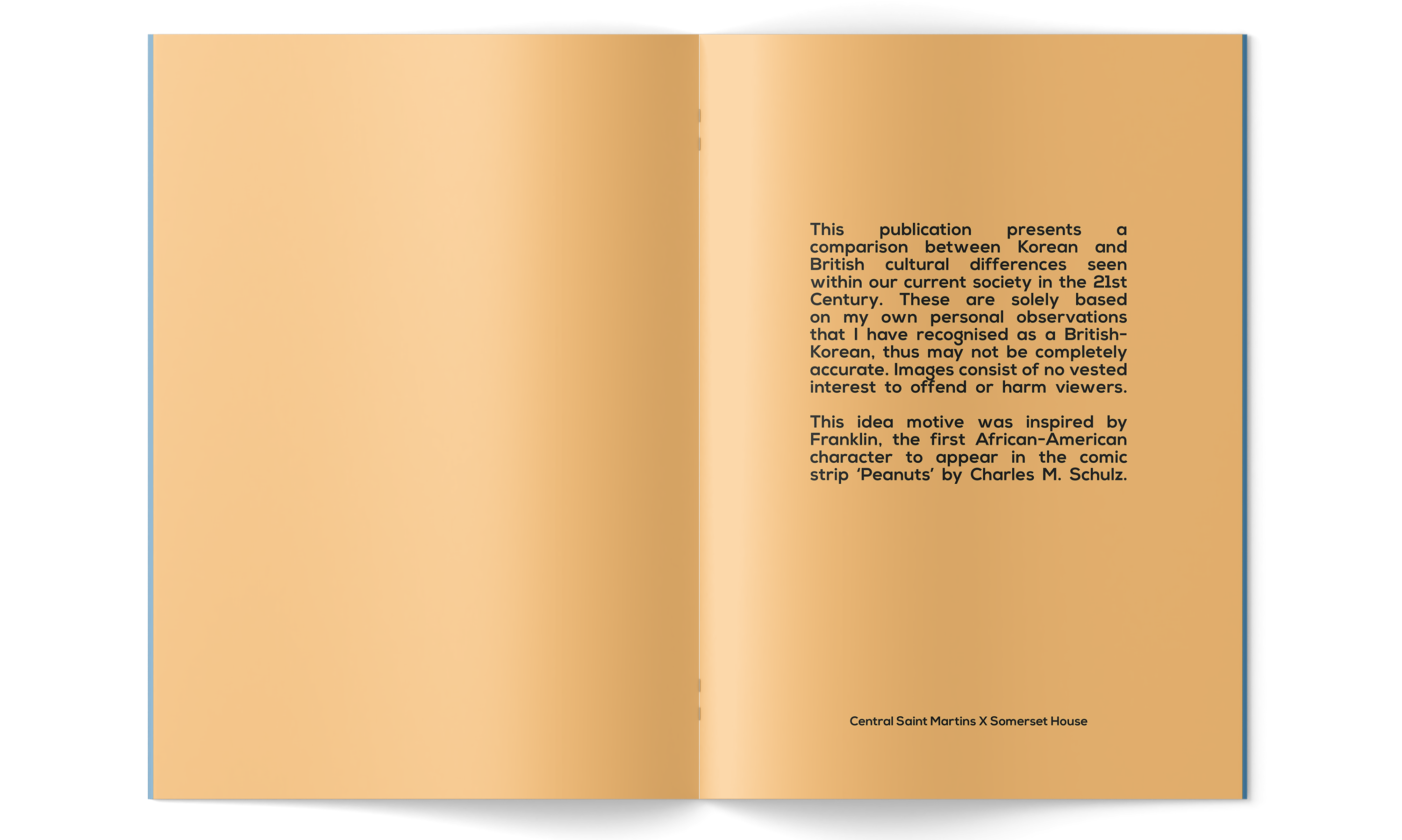
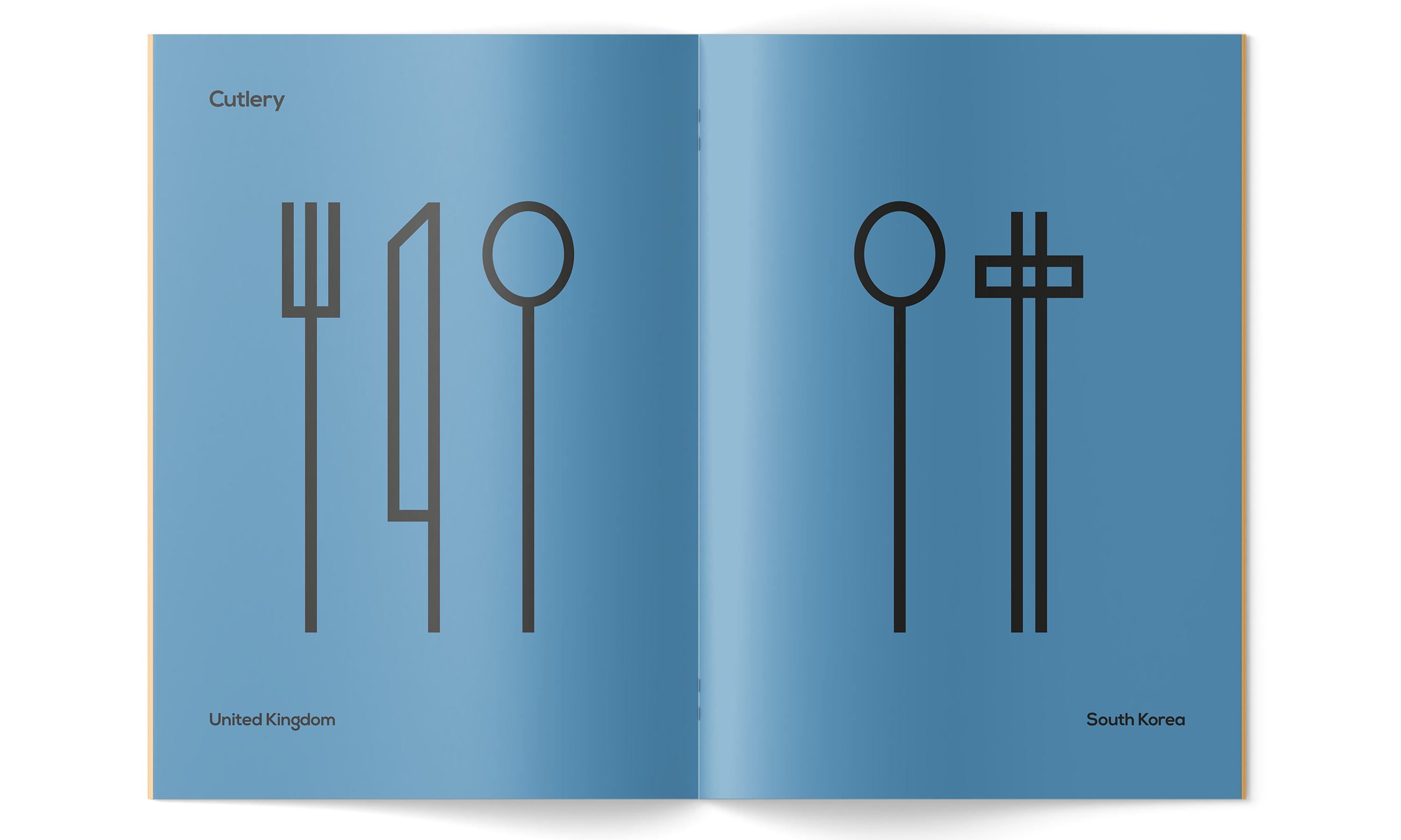
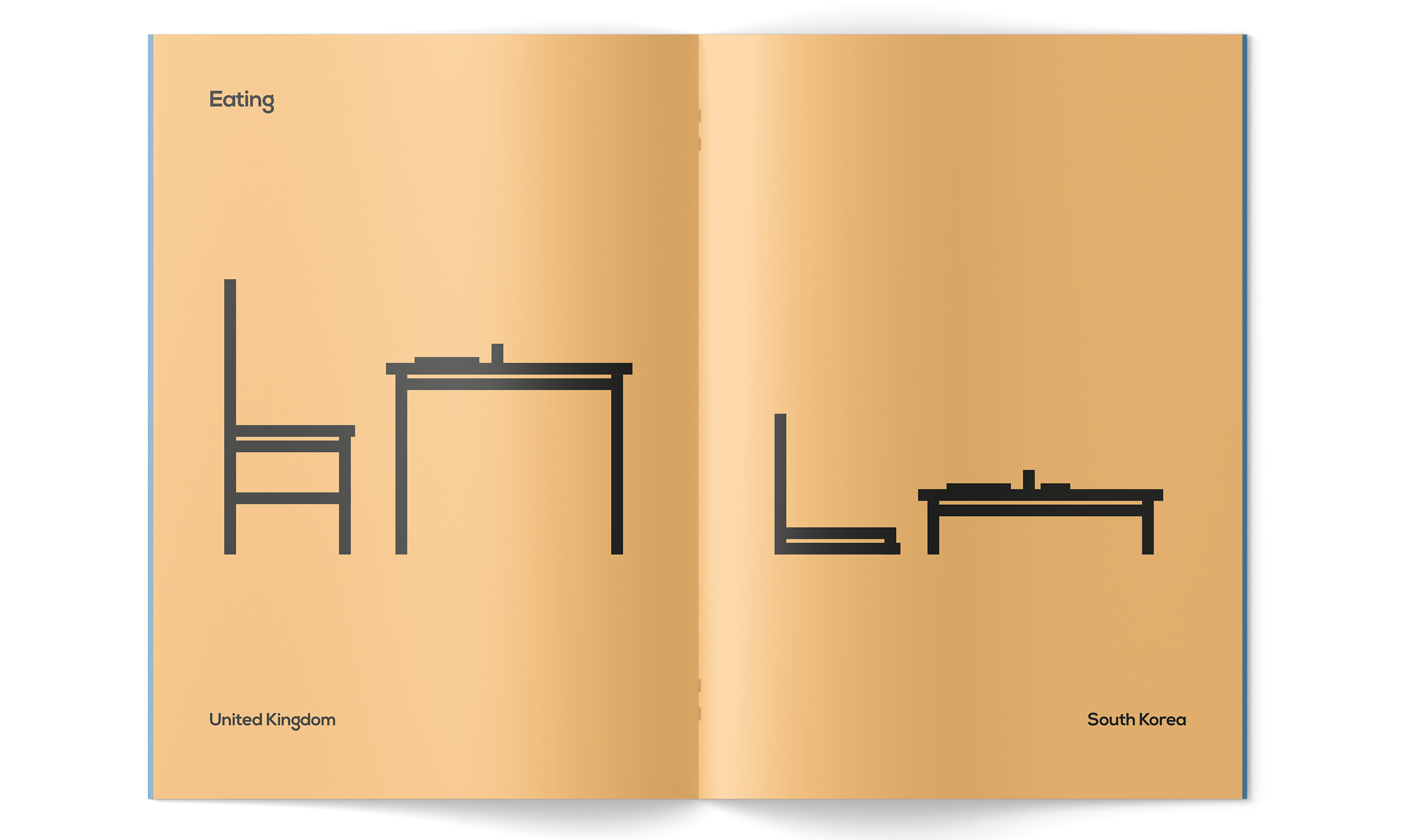
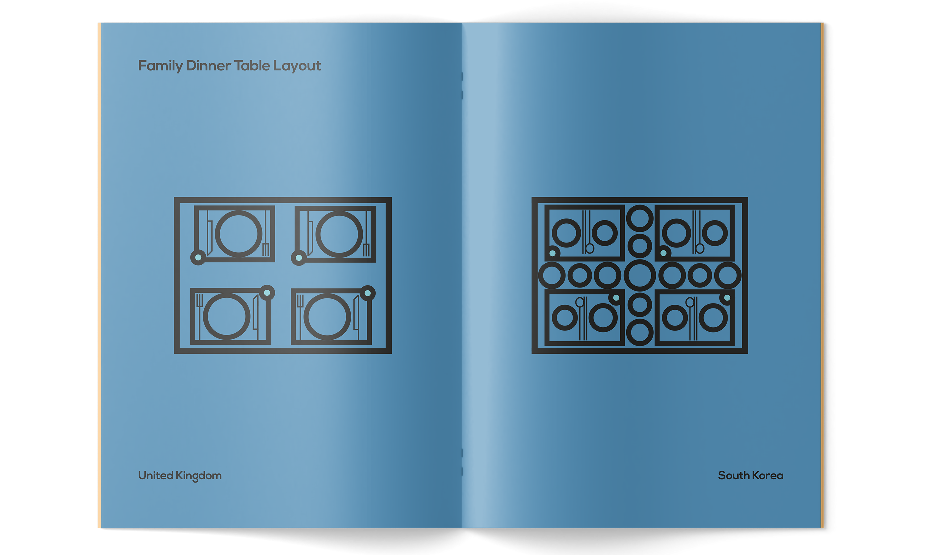
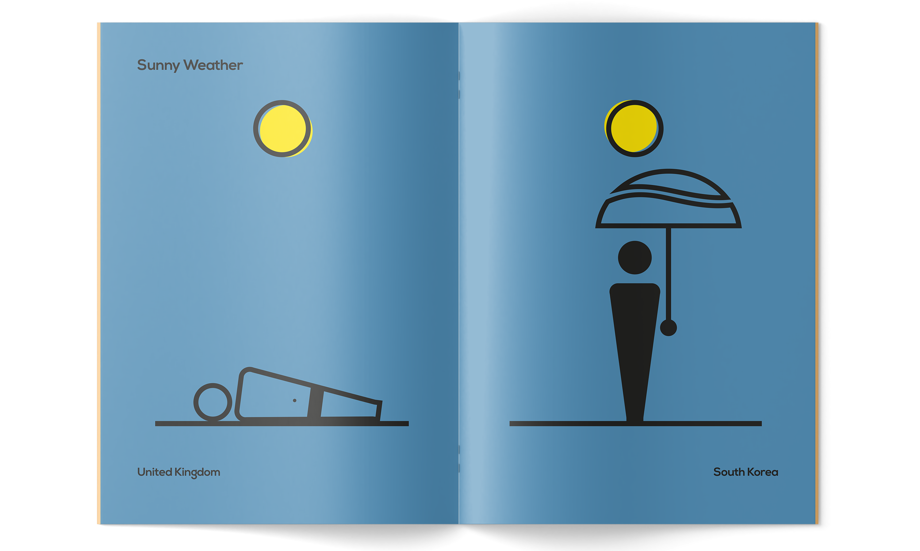
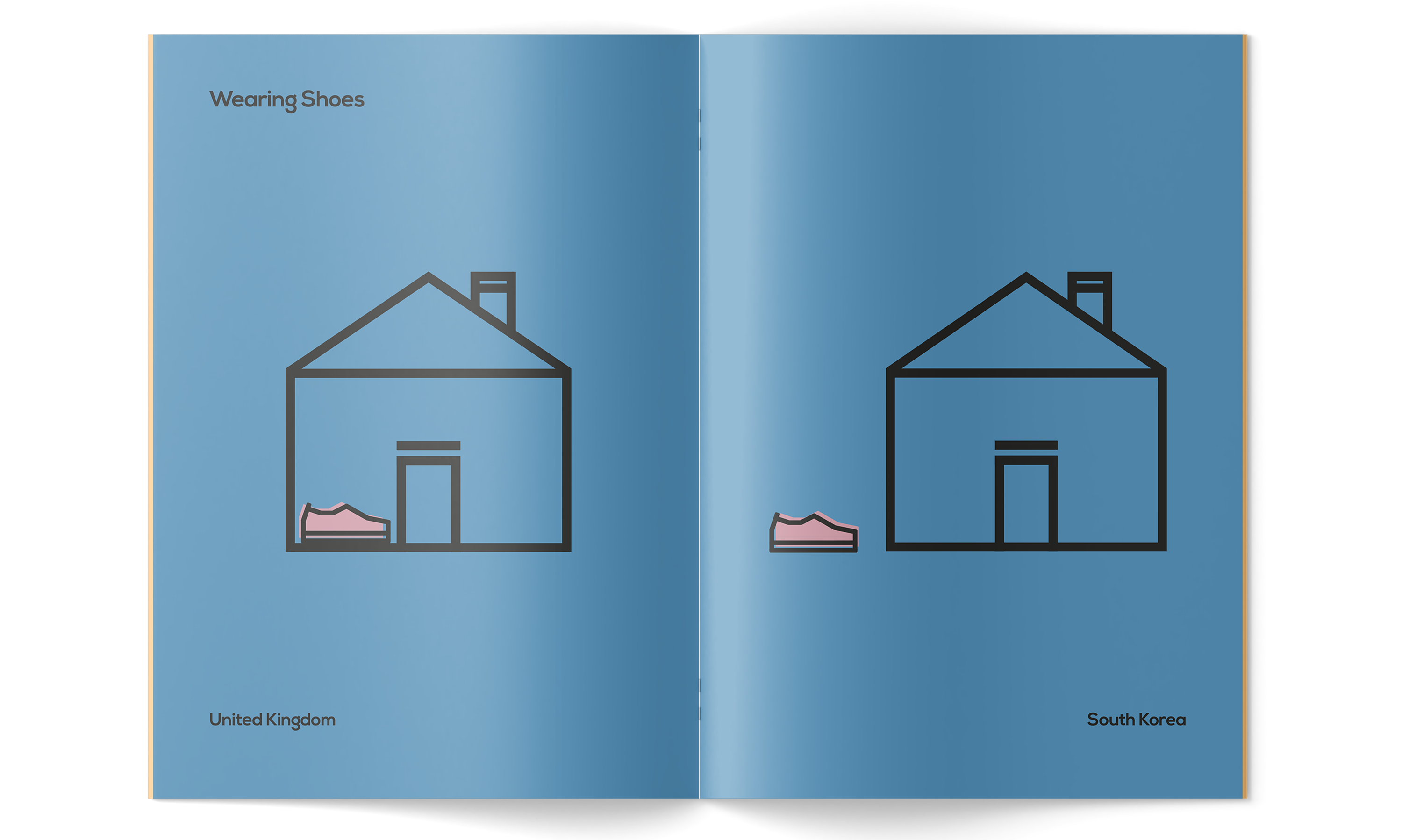
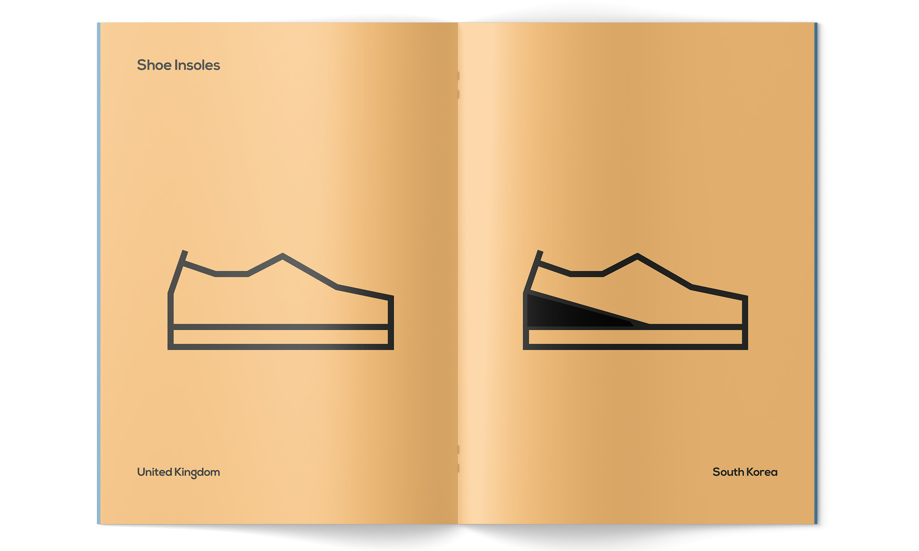
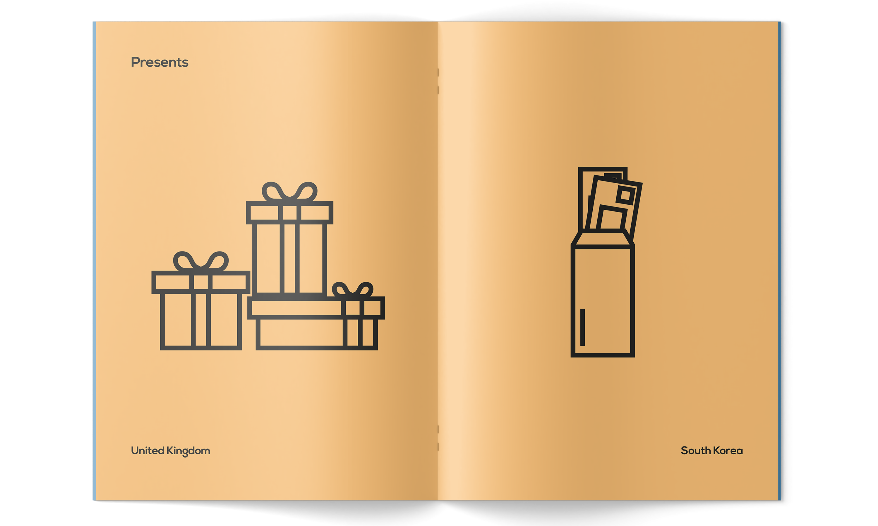
Somerset House x CSM: Franklin
c. 2019This publication presents a comparison between Korean and British cultural differences seen within our current society in the 21st Century. These are solely based on my own personal observations that I have recognised as a British-Korean, thus may not be completely accurate. Images consist of no vested interest to offend or harm viewers. This idea motive was inspired by Franklin, the first African-American character to appear in the comic strip, ‘Peanuts’.


Broken Paperclips
c. 2019‘Broken Paperclips’ is a bespoke typeface design that consists of alphabetic characters inspired by the shape and mechanics of a paperclip. I aimed for this to be a playful outcome rather than a more conventional and useable typeface design. This piece presents an underlying insight into the qualities and features of the most simple objects around us and how we have the ability to utilise everyday objects that we bypass, such as a paperclip, to create unique typographic works.

Commission: Mimo
c. 2019I was given a commission to rebrand Mimo – hairdressers located in Southwest London, run by a friendly married couple. They wanted to update their identity which they previously felt to be quite old-fashioned. Although this is still a work-in-progress project, where they have yet to rebuild the store front and other little details, I managed to develop a new logo and relative business cards.

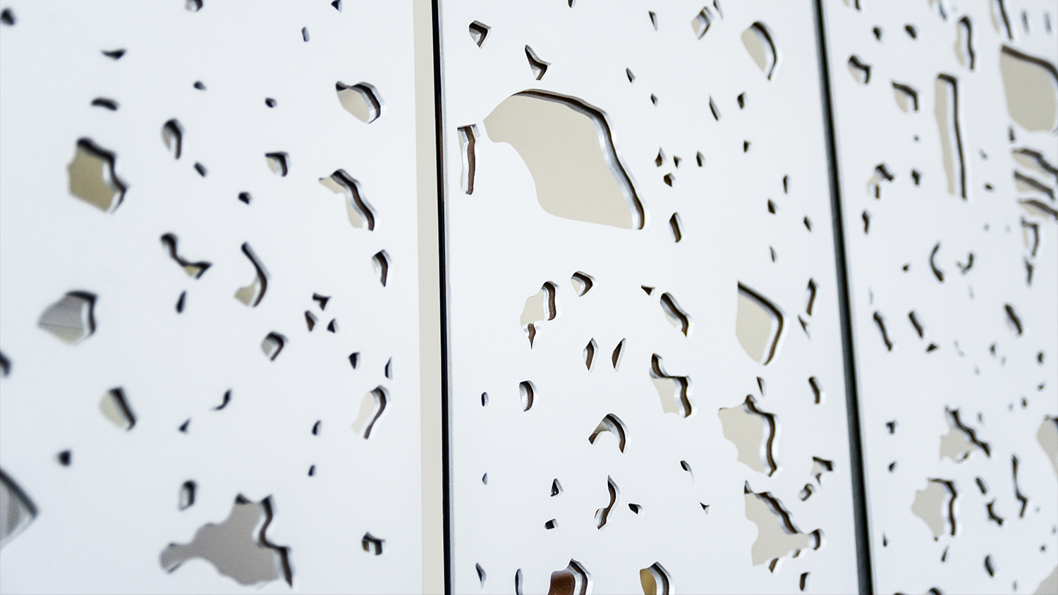
Macroscopic Mirrors
c. 2019These mirror designs have derived from interruptions and formations found outdoors in the natural environment at macro-scale. The struggle for viewers to see themselves through an opening reflects the difficulty of how I had to look for natural macroscopic shapes in which these abstract shapes and forms were extracted from. By placing these pieces inside, the visual imagery of bringing natural elements found outdoors into indoor settings is conveyed.
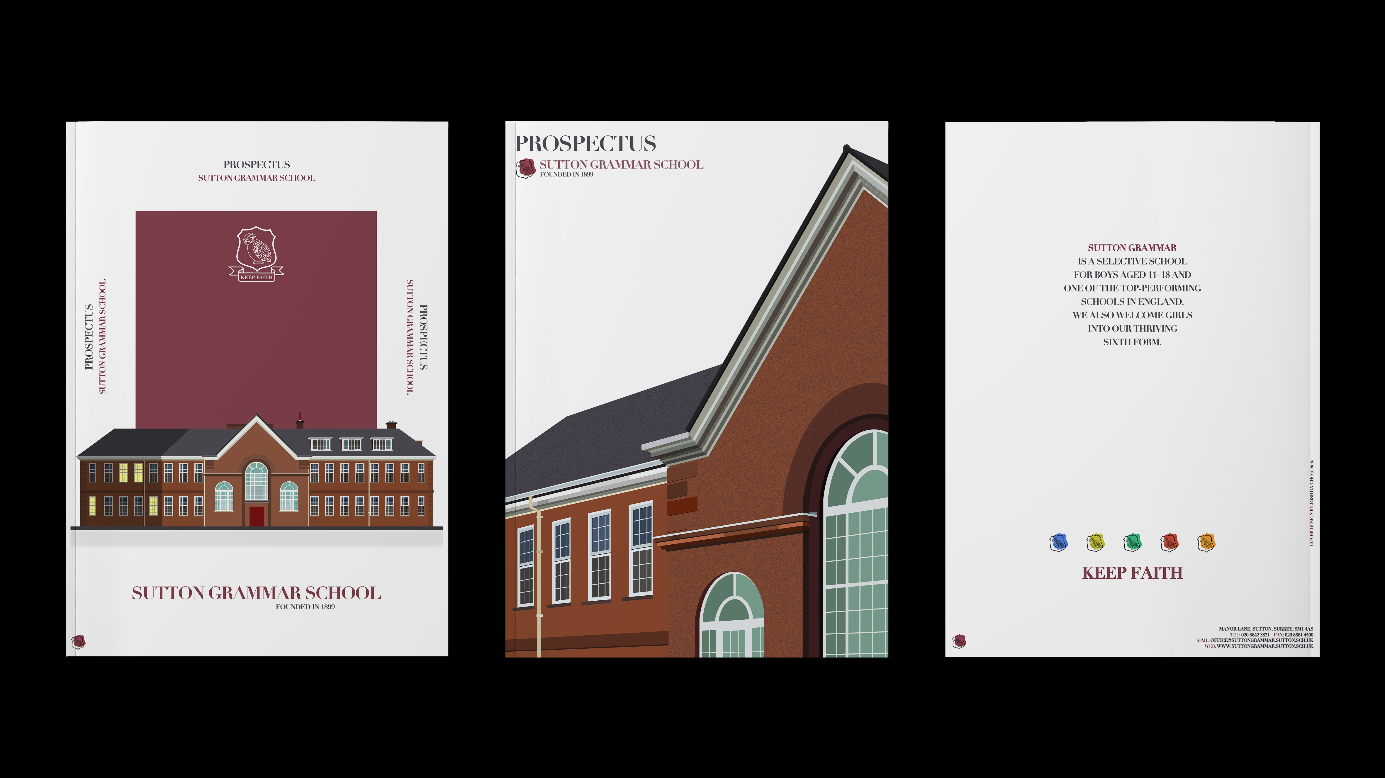
Sutton Grammar Prospectus Covers
c. 2018I produced a selection of two front cover versions which both portray the facade of the historic school building in a very digital and illustrative stylistic approach. The back cover includes a short descriptive text written by the headmaster with also other necessary information close to the edges, as well as the school's slogan and house colours.
Miscellaneous Works
c. Ongoing ~This ‘Miscellaneous Works’ tab contains all my other creations, outcomes and artworks that I felt belonged together. Everything that you can see has been self-directed and have mostly been produced from sudden creative drives/stimulations. Some examples of work are essentially byproducts during experimental processes. I will constantly be adding more work into this page as I exponentially dig up from my vast collection of folders from archived work to new work.