Commission: Mimo
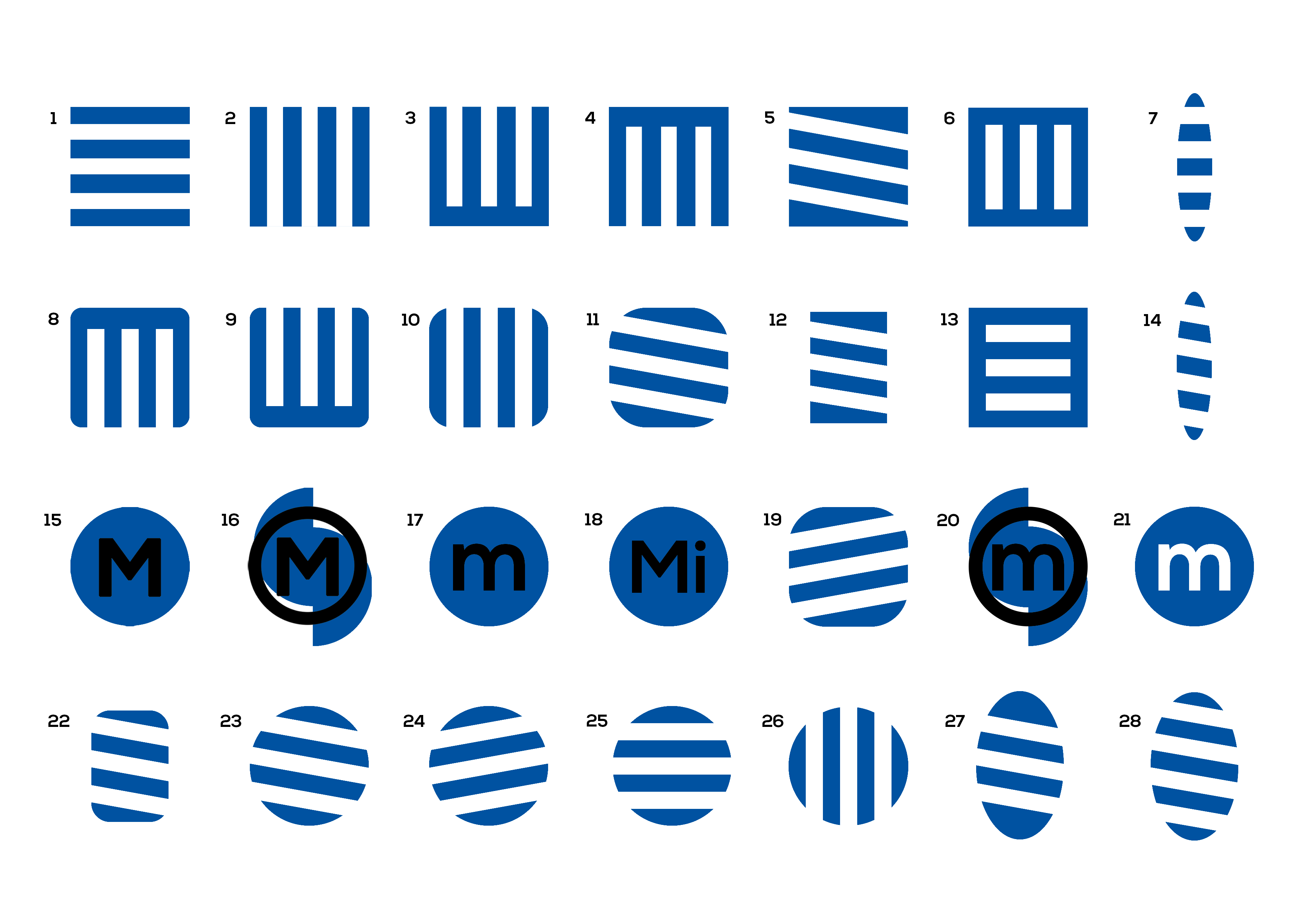
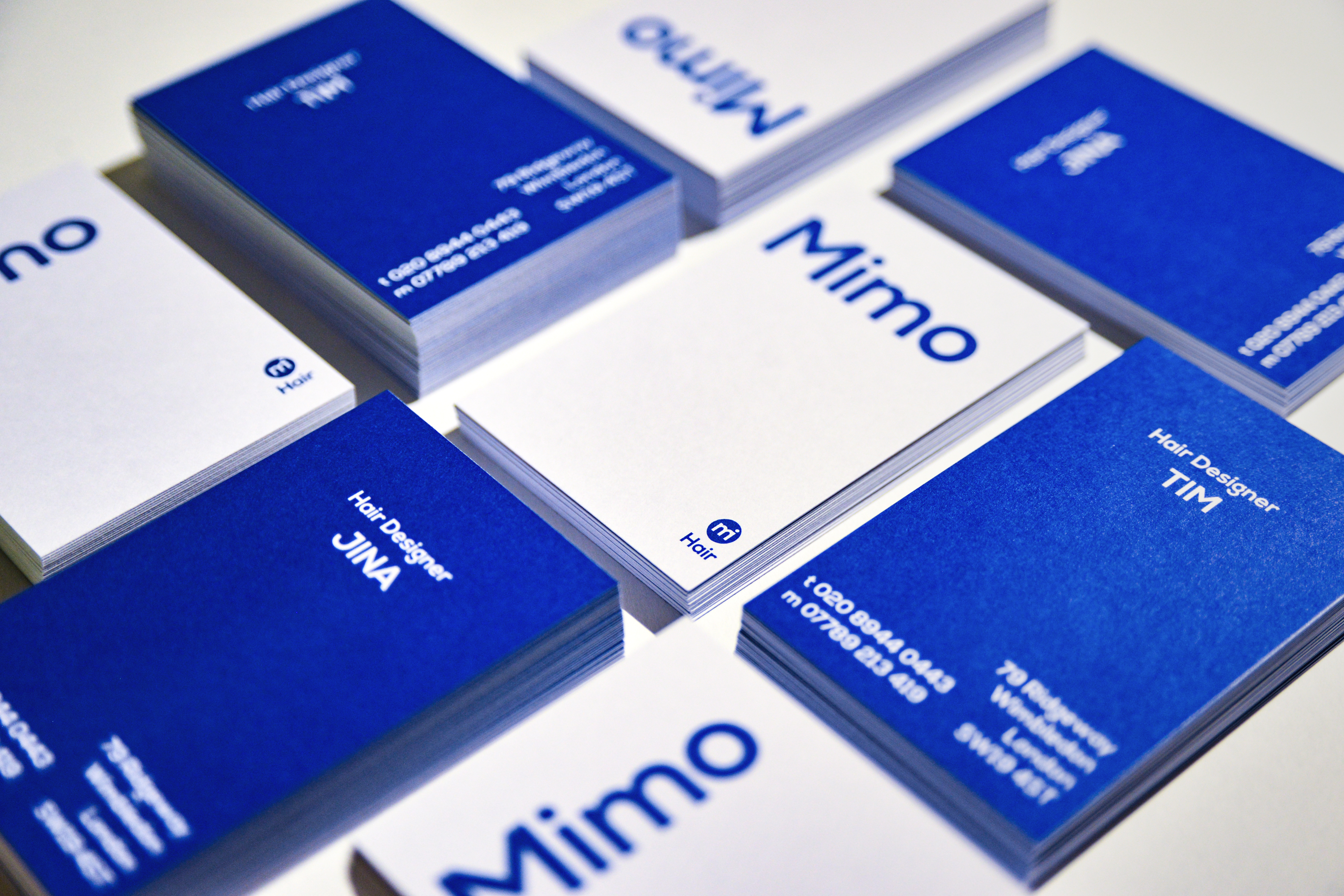
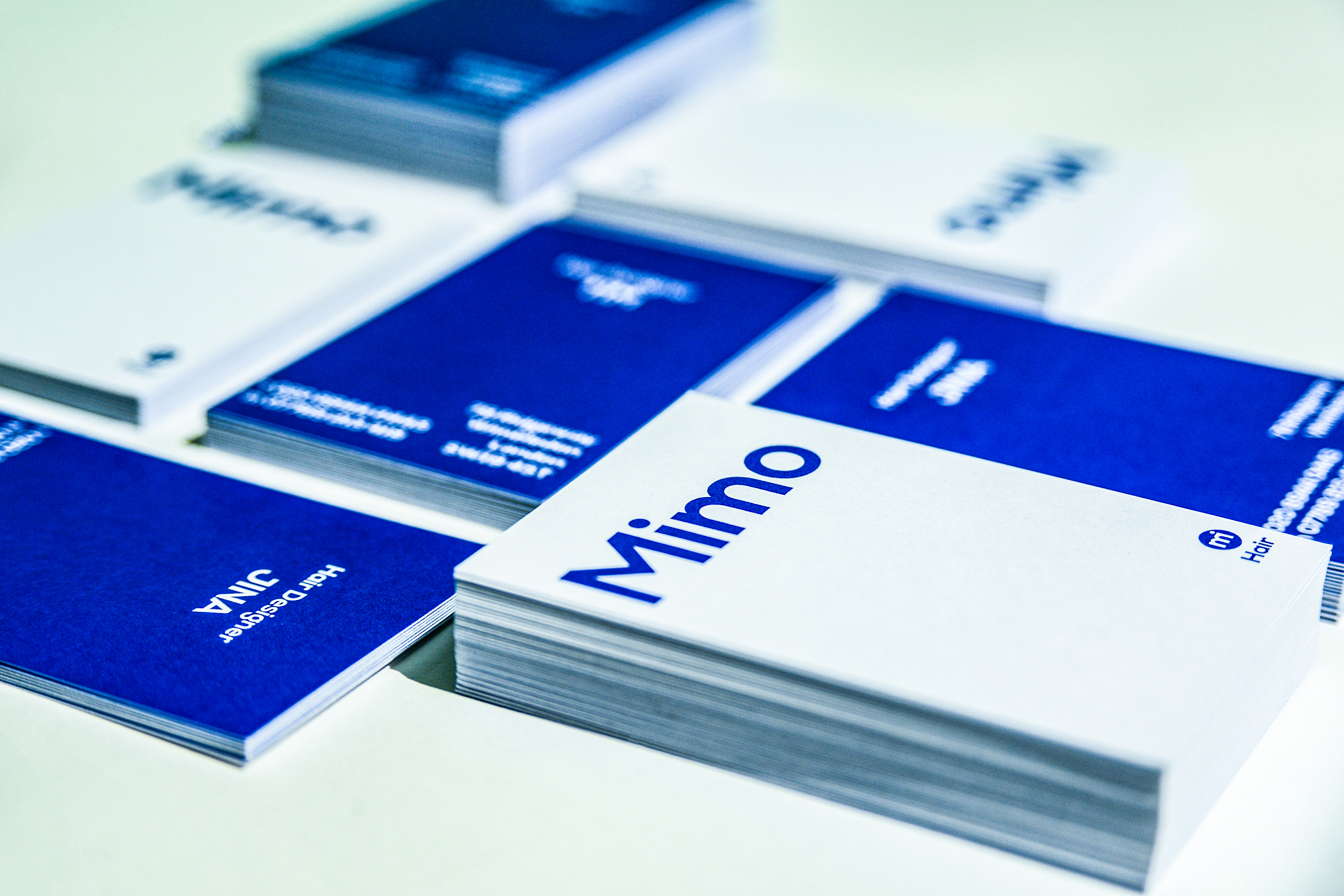
c. 2019I was given a commission to rebrand Mimo – hairdressers located in Southwest London, run by a friendly married couple. They wanted to update their identity which they previously felt to be quite old-fashioned. Although this is still a work-in-progress project, where they have yet to rebuild the store front and other little details, I managed to develop a new logo and relative business cards.
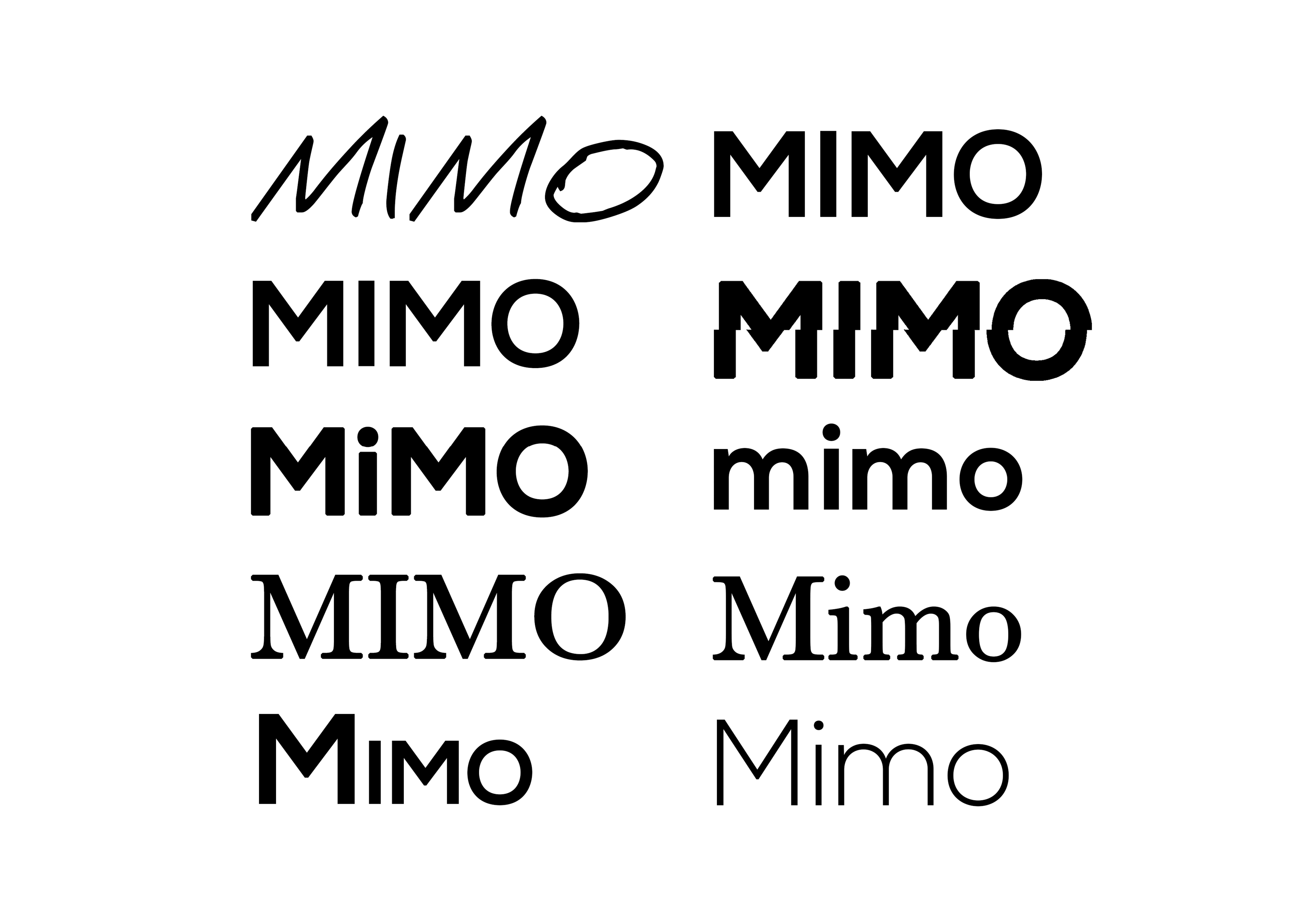
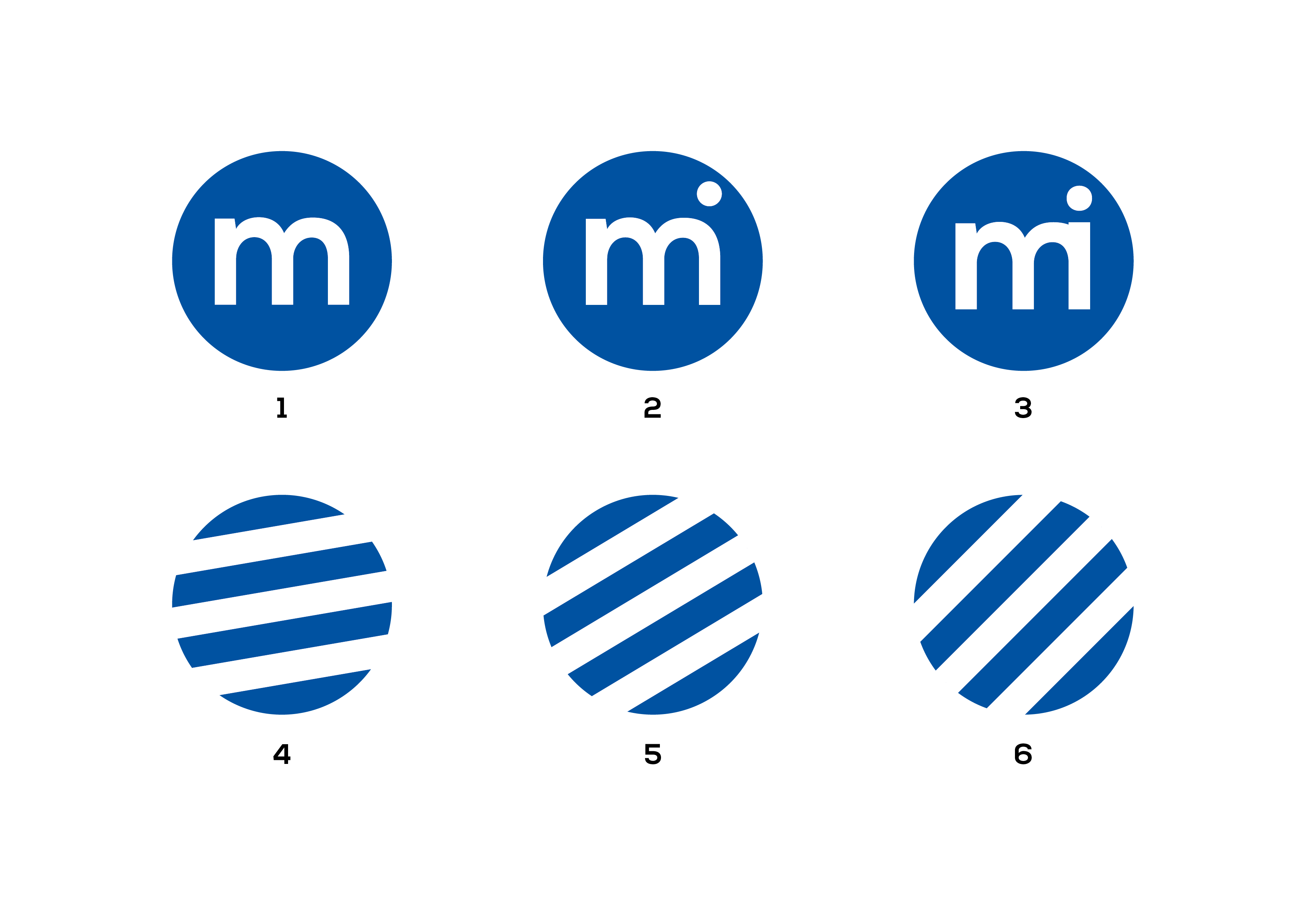
For the new logo, I tried to make a very minimal and clean design yet effective in suggesting an idea of its service to viewers. The deep blue colour was a noticeable transformation from their previous pastel-like blue. The icon presents the letters 'm' and 'i' as combined letterforms which phonetically sounds out the term 'me’. Lower-caps were preferred to achieve a more friendly and welcoming aesthetic.
